An Interplanetary Journey in Design – Building the Europlanet Brand

Vix Southgate (Europlanet 2024 RI Communications Team) describes some of the creative steps (and missteps) in nearly two decades of the Europlanet brand.
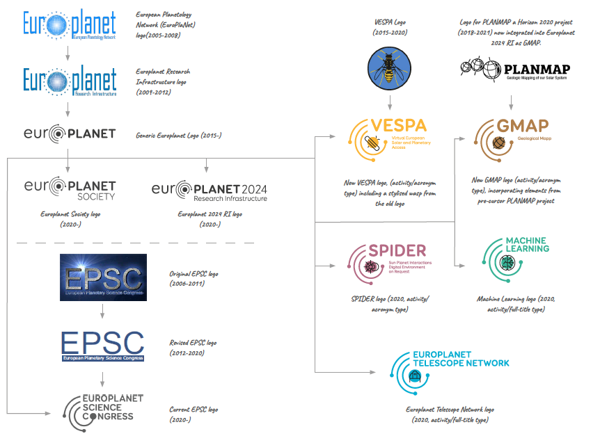
From its origins as a network to bring the European planetary community together, Europlanet has evolved greatly over the past 17 years. Today’s multi-faceted Europlanet ‘umbrella’ covers not only a research infrastructure and membership society, but all kinds of projects, events, hubs, groups and programmes within the planetary community. Inevitably, the branding associated with Europlanet has also evolved but, until 2015, when Science Office designed the current Europlanet logo and elements, there was no consistency that pulled all the facets of Europlanet together. Since 2020, we have been undergoing a further transformation to appraise and build on our core logo to develop a coherent and sustainable brand in-house that can support our expanding community in the future.
Europlanet Branding Through the Ages
The European Planetology Network (EuroPlaNet) was launched in 2005 with funding from the European Commission’s Framework 6 Programme and, as with all new ventures, branding was an important consideration. The original logo, commissioned by the management team at CNRS, referenced the planetary theme with a 3D sphere, as well as the EU funding with a surrounding ring of stars. With minor modifications to colour and wording, the logo was retained through several phases of the project, including the Europlanet Research Infrastructure (2009-2012) and the Europlanet Consortium (2013-14).
Advances in online visibility, social media and, ultimately, the expanding competition of information on the internet, have meant that a strong brand has become an essential requirement of every organisation. After a decade, Europlanet needed a new look. In 2015 Science Office began the process of coordinating and stylising the Europlanet brand and making it purposeful and unique. They came up with a clearly recognisable design that uses the letter ‘o’ to depict a sun with three orbiting spheres, as a representation of a planetary system. This main logo is widely used today for cross-cutting Europlanet activities and where sustainability beyond the lifetime of any particular funded project is important. Variations on the main logo are used for Europlanet’s major structures, including the Europlanet Society and the Europlanet 2024 Research Infrastructure.
Evolution of EPSC logos
In the early days of Europlanet, the teams running activities and events tended to create their own logos independently, with no overall coordination from a design perspective. As a result, the logo for the European Planetary Science Congress (EPSC), which was inaugurated in 2006 as part of the EuroPlaNet project, contained no links to the main Europlanet brand. The original EPSC logo was refreshed in 2012 with a cleaner version and transparent background, but this still did not feature any common visual language that connected it to Europlanet.
As the major annual meeting on planetary science in Europe, EPSC currently attracts around 800-1000 participants each year and is an important fixture in the planetary community’s calendar. When the Europlanet Society was formed in 2018, and became the parent organisation of EPSC, one of the first decisions taken by the Executive Board was to clarify the link and rename the meeting as the Europlanet Science Congress (retaining the EPSC acronym for continuity). A new logo was required, and it was this rebranding exercise that initiated the development of a flexible design architecture that could be applied to the wider Europlanet family.
The redesigned EPSC logo incorporates Europlanet’s top-level use of replacing the letter ’o’ with an element in the design. A cutaway version of the ‘orbits’ motif creates a space that enables the event’s own identity to be highlighted.
Adapting to Activities
Following on from the EPSC rebrand, design elements from the core logo have been tailored to coordinate and differentiate between the ‘top-level’ branding, and sub-brands related to ‘activities’ and ‘events’. This enables a distinctive visual architecture that is immediately recognisable as being part of Europlanet, but also allows elements to develop their own identities. This structured approach gives the ability to add more logos to Europlanet’s ever-growing network.
‘Activity-type’ branding is used for the services and programmes carried out by Europlanet, including the Europlanet Telescope Network, VESPA, SPIDER, GMAP and Machine Learning. Like in the ‘events-type’ brand, an ‘activity-type’ logo includes the characteristic Europlanet orbits element in cutaway form. However, it also incorporates a motif that represents the activity’s distinct identity, which is reinforced by a distinguishing colour.
As many of the activities have been running for some years, either as a part of Europlanet or as separate projects that have since come under the Europlanet umbrella, the motif is a mechanism to include features of former logos into the new Europlanet sub-branding. The format is flexible enough to adapt to different situations, such as where an acronym is the main identifier, or where a name needs to be written in full.
Europlanet Branding 2022
In 2021, I was tasked with starting an in-house analysis of all Europlanet branding, with a view to coordinating, developing, and future-proofing the design elements. This review highlighted the need for the redrawing of many existing logos that had been stretched or altered during multiple iterations. Although the logos themselves look almost identical to their former versions, subtle changes ensure continuity-of-structure across all branding.
As well as standardising the essential elements across all the logos, we also identified other areas of Europlanet functions that needed sub-brands. Everything is summarised in the Europlanet Branding Guidelines Overview, a document that includes all logos and explanations of their purpose within the Europlanet brand, as well as more specific guidelines for the use of sub-brands by the communities running the activities or events.
New Logos on the Block
The 2022 update has included the creation of several new logos for previously unbranded functions of Europlanet. Using a variation on the top-level branding style, the 10 Regional Hubs now have a specific logo that incorporates the region name into the Europlanet Society brand.
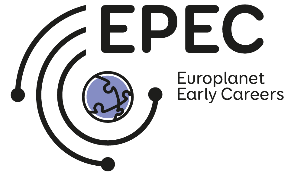
The Europlanet Early Careers (EPEC) network, which launched in 2017, has until recently, had a logo that incorporated the orbits of the main Europlanet main logo into the acronym. Under the new guidelines the logo would have read as EOPEC, which is, of course, incorrect.
Using the activities-style logo template, the new EPEC logo incorporates four jigsaw pieces to symbolise the interconnectedness, within the early careers network, and the joining together of a community.
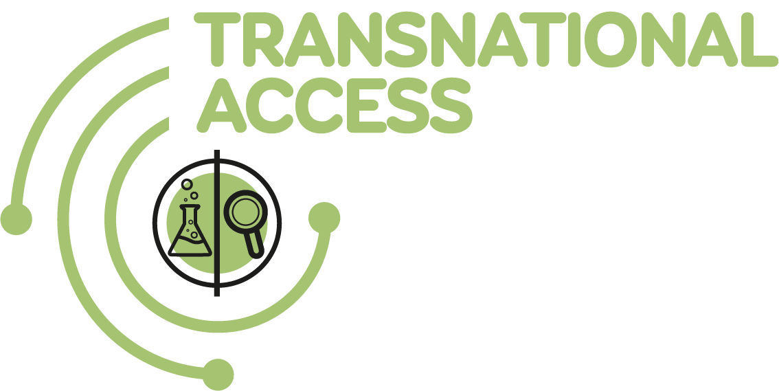
Transnational Access (TA), a programme that supports research visits to facilities and planetary analogue sites, has been an essential part of Europlanet since 2009 but, to date, did not have its own branding. Using the ‘activity-style’ design template, the TAs have been given a logo in pale green that highlights the lab and field elements of the programme within the central motif.
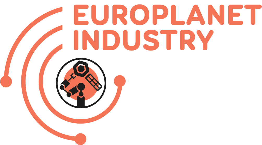
Europlanet Industry activities promote the benefits of collaboration between academia and the commercial sector. A new Industry logo in orange incorporates a technological theme in the design.
Overall, we hope that the new branding will help reinforce Community, highlight its activities and strengthen the Europlanet brand. All the logos and guidelines can be found on the Europlanet website.
Templates for the future
Design templates have been created that categorise the logo elements into three styles, which will make future design easier to assess and develop:
- Top-level branding is used for anything that requires the use of the elements in the main Europlanet logo. Wherever this main logo is used, the solar system design element will always take the place of the letter ‘o’.
- Activity branding is used for all Europlanet activities and programmes. This logo type includes two distinct templates: acronym and full title.
- Event branding follows the same lines as the activity branding, whilst also using the same rule of replacing the letter ‘o’ with part of the design elements. This distinguishes these logos as ‘events-type’ and creates a connection, signifying the meeting of Europlanet activities.
