Analysis technique – Thematic coding
What is this tool?
Thematic coding is a process of categorising open-response (qualitative) data into common themes to assist in identifying patterns within the dataset.
What kind of activities can I evaluate with it?
Thematic Coding isn’t an evaluation technique in itself, but is a useful analysis technique to apply to most sorts of open-response data collected using other techniques (for example, Three words, Graffiti Wall, Peer Interviews, Photograph Diary and Snapshot Interviews).
When should I use it?
This tool will help you analyse your data after an event.
What do I need?
- Qualitative responses (preferably in typed form)
- A mechanism to group them together (e.g. highlighters; cut up strips of paper; appropriate computer software)
Let’s get started…
Deeper insights on the success or otherwise of an outreach activity or event can be gained by grouping participants’ individual responses to open-ended questions into common categories. This process is the basis of all ‘coding’ of qualitative data – dividing it into common themes to help better understand the overall patterns in the responses.
Let’s start the analysis
It is often helpful to begin the analysis by reading through your data once or twice. As you do so, you might want to make a few notes about different categories of responses that seem to be present. For example, if you have asked a question about why people have come to an event, the responses might fall into categories such as interest (responses about interest in the subject matter), fun/enjoyment (thought it sounded fun), learning (thought they would learn about the topic), no choice (someone else insisted they come), social (they wanted something to do with friends or family).
In some cases (e.g. if you’ve asked what they liked most about an event), responses might occur at different levels. Someone might say they liked a particular aspect best and then say why (even if you haven’t asked why). In this case, you might need two sets of categories – one for which aspect they liked the best and one for the reasons.
Depending on the way the data was collected, you might not be able to code a response at both levels – that’s fine. Just code the data you have. In addition, at times, a response might fall into two categories (‘I came to spend time with my daughter, and I wanted to share my interest in Saturn with her’). This might fall under the categories ‘family’ and ‘interest’.
Now it’s time for coding
Once you’ve broadly familiarised yourself with your dataset then you’re ready for coding the data into common themes (codes). There are lots of ways to do this – some people print them out on paper and use highlighter pens to group connected words, other people cut them up so that each word is on its own piece of paper, and they can be physically grouped together in little piles.
In this case we’ve done it electronically by looking down the “Word” column and thinking about what aspect of the Europlanet for Schools website that response is commenting on. There are no ‘right’ and ‘wrong’ categories – the idea is to try to link them in a way that is useful to the purpose of the evaluation.
It’s clear on reading through the categories that people commented on different parts of the website – for example what it contained (its content), how it looked (design characteristics), and how it worked (its functionality). So, these are three obvious initial categories to start grouping our responses into. Additionally, there are some comments that aren’t obviously linked to the website itself, but are more general reactions.
In this case we are looking for aspects of the website that participants found worked well, or could be improved, so dividing these reactions into ‘positive’ and ‘negative’ is useful for the project team in identifying what to keep, or what to change. Finally, there are a few comments that were either difficult to judge the meaning for (e.g. “cost” or “experience”), or were more general descriptions that didn’t fit elsewhere.
Looking at ‘content’ and ‘design’, most of the words are fairly descriptive. We could perhaps divide some words in the ‘content’ category into sub-categories relating to ‘level’ and ‘depth’ but for most purposes this would not be essential. Of more immediate interest however is the ‘function’ category. By reviewing those words, we can quickly see that there are a range of both positive and negative words – this looks like a clear place where further investigation might be useful, in line with the purposes of this evaluation exercise. Dividing ‘function’ into ‘function – positive’ and ‘function – negative’ and allocating the entries accordingly quickly allows us to see what functional pros and cons the teachers reported during their use of the site.
Example of revised coding of word list categories, where content and function have both been divided into sub-categories
OK, what do I do with my data now?
Once you have coded your data (put it into categories), then you can summarise it. Note that if you have fewer than 100 responses it’s usually best to use the specific numbers in your reporting, for example ‘15 of 21 respondents felt they had learnt something at the event’ or ‘43 of 48 respondents agreed that they felt inspired by their experience’.
The final revised categories (content; design; function-positive; function-negative; positive-general; negative-general; and other) can be graphed in order to allow us to understand much more clearly how people responded to the website.
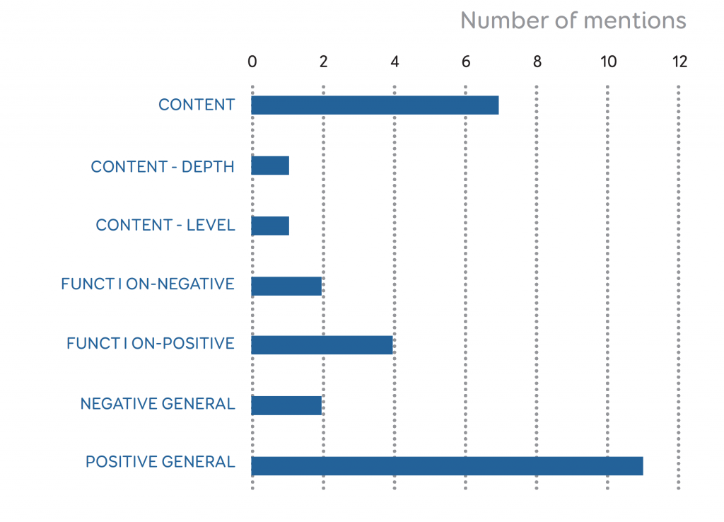
In particular the categories help us focus our attention and effort in deciding what actions to take based on the feedback. For example, the overall feedback is extremely positive, which could be very useful for reporting back to a funder to help argue for continued financial support. The content and design of the website in particular appear to be working fine (or at least, any negatives are balanced by positives from other respondents). However, although the functionality is generally well received, it looks like there are some specific elements that could be improved upon – especially the search function, and perhaps some other simplifications. These insights weren’t really possible from the more general feedback originally, but help identify specific recommendations moving forwards.
You may also be able to look at patterns in your data according to other demographic categories, for example gender, age or the teacher’s subject specialism. Of course this depends on you having collected your original data in such a way as to be able to connect those demographics to your codes. However, you do need to be cautious, especially in the case of methods such as Tool 6 -Snapshot Interviews when the data has been collected in a possibly less accurate way (in the case of snapshot interviews, based on visual impressions). Nevertheless, sometimes trends do appear (i.e. if there are clear differences by gender in favourite/least favourite parts of an event).
Got it! How can I take this further?
Thematic coding is one of the most common (and most useful) qualitative analysis techniques, and there are plenty of further resources available externally if you’d like to extend this approach, for example:
- A great (straightforward and easy to follow) overview of coding open response texts (e.g. from within survey data) is provided at http://www.infosurv.com/how-to-code-open-end-survey-question-responses/
- For a slightly deeper description of the same process see: https://getthematic.com/insights/code-open-ended-questions-in-surveys-to-get-deep-insights/.
